
Bold Color, Modern Restraint: Inside Five Bay Area Homes
In a modern home, bold color is at its most powerful when it’s deliberate. At Niche Interiors, our San Francisco interior design studio uses saturated hues like peacock blue, emerald and moss green, oxblood and raspberry within a modern framework of clean lines, natural materials and sculptural forms. The result are homes that feel confident and personal without tipping into maximalism. Below is how we approach color in our interior design projects, highlighting five of our most vibrant, colorful homes throughout San Francisco and in Hillsborough and Atherton on the Peninsula.

Niche Interiors’ Approach to Color in Modern Interiors
Color with intention
A saturated hue might anchor a living room, mark the transition from a foyer into the rest of the house, or reward you for opening a door, which is why powder rooms and media room are often where our clients are boldest with color.
We ground color in neutrals and natural materials
Walnut, oak, bronze and stone keep strong color from feeling flat or theatrical. The warmth of wood, a modern architectural backdrop, and a healthy mix of neutrals is what lets a peacock velvet sofa read as modern.
We choose depth over brightness
Most of our color palettes lean toward jewel tones and inky, saturated shades instead of bright primary colors or pastels. Richer colors feel enveloping, age well, and work with the soft light we get throughout the Bay Area.
We often start with the art
With Jennifer’s background in art history, many of our palettes begin with a piece the client owns or one we have helped them find. In our Menlo Park project, for example, peacock velvet armchairs pick up the blues in a commissioned painting by Yossi Ben Abu in the adjacent dining room.

Why Peacock Blue Keeps Showing up in our Work
If there is one color clients associate with us, it is peacock. It sits between blue and green, so it pairs naturally with walnut, brass and bronze, and it shifts with the light throughout the day. You will find it in a curved velvet sofa in Hillsborough, lacquered foyer walls in Woodside, a formal living room and powder room in Atherton, a velvet sofa in our Marina pied-à-terre, Holly Hunt armchairs in Menlo Park, and a graphic media room rug in Noe Valley.

Color Drenching, Done with Restraint
Color drenching means painting walls, trim, built-ins and sometimes the ceiling in a single color, so the room wraps around you. We use it selectively: in the media room of our Marina pied-à-terre, walls, built-ins and trim are all painted in Benjamin Moore Bourbon Street paired with a hand-painted ceiling, and in our Atherton project the primary bedroom’s paneling is drenched in a deep blue gray. Used heavily in one or two rooms and with a lighter touch in others, bold color gives a house depth, contrast and continuity. Used everywhere all at once, it loses its impact.
Niche Interiors Homes that Show Our Approach to Bold Color
These five homes in Hillsborough, San Francisco and Atherton each use saturated color differently: jewel tones layered with natural wood, a full palette of mulberry and teal, oxblood ceilings over Victorian details, and bright accents against crisp white walls. What they share is a modern foundation that makes the color feel intentional rather than as an afterthought.

Hillsborough: Jewel tones in an organic modern home
In this 8,000-square-foot Hillsborough home, designed with Mak Studio and featured in Architectural Digest in May 2026, a curved peacock velvet sofa anchors the formal living room, mossy green wool chairs surround a sculptural walnut dining table, and an emerald green sectional sets the tone in the media room. Oak, walnut, brass and luxurious neutral fabrics keep the palette grounded, while gold leaf and Caroline Lizarraga’s hand-stippled walls add a quiet glamour. View the Hillsborough project
Marina Pied-à-Terre: Mulberry, peacock and lilac
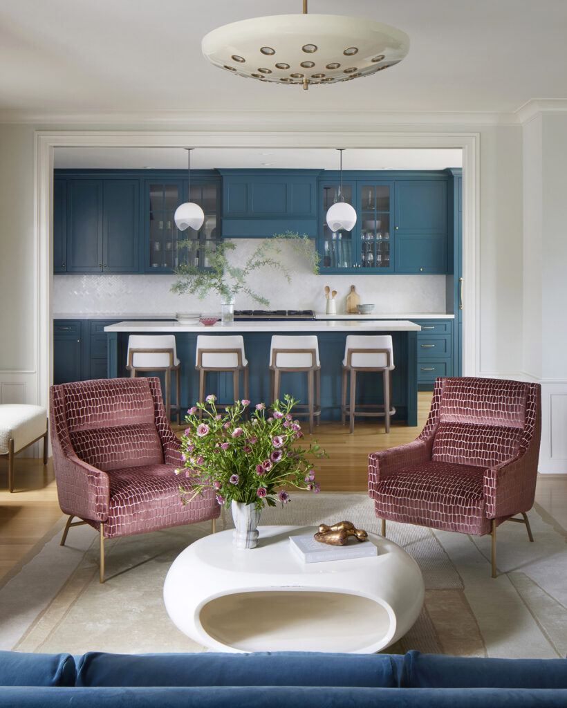
This may be our most color-forward Bay Area project. We started with a palette of the client’s favorite colors – mulberry, teal and lilac, then layered in pattern and modern furniture: a peacock velvet sofa and raspberry cut-velvet armchairs in the living area, deep teal kitchen cabinetry with antique brass hardware, and a raspberry media room with a hand-painted ceiling and a custom John Pomp chandelier. The classical French details of the 1930s architecture give all the color a calm backdrop. View Marina Pied-à-Terre

Jackson Square: Vibrant modern + crisp white
In this San Francisco condo renovation we painted every room in a crisp white so the vibrant furnishings, custom mirrors and artwork could take center stage. Blue velvet mid-century-inspired armchairs are paired with salmon lacquer side tables and a colorful abstract painting by Melissa Dickenson acts as the living room’s focal point. Custom colored mirrors in the bar, brightly colored built-ins and swivel chairs in the music room, and a playful abstract rug in the family room carry color through the rest of the home. FSC-certified oak floors and zero-VOC paint make it as healthy as it is bold. View the Jackson Square project
Hayes Valley Victorian: Oxblood and ochre
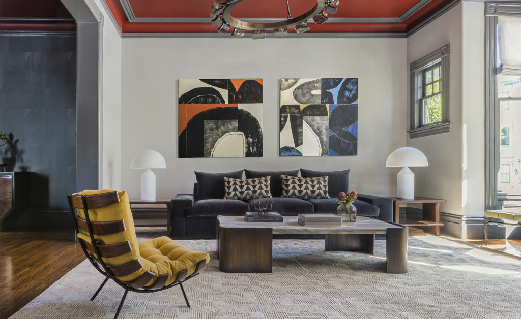
For this 1900 Victorian, the client asked for a home that felt moody, creative and artistic. Oxblood ceilings and charcoal gray moldings frame the original architectural details, a mid-century Costela lounge chair re-upholstered in a rich ochre fabric injects another jolt of color to the living room. A forest green bed sits against black and white graphic wallpaper in the primary bedroom. The project was featured in Interiors magazine in June 2023. View the Hayes Valley Victorian

Atherton Residence: One color, carried through the home
In this 7,000-square-foot Atherton home, we carried teal blue from the formal living room into the powder room which features hand-painted walls by Caroline Lizarraga and a marble vanity. Upstairs, the primary bedroom’s paneling is drenched in a deep blue gray color and layered with luxurious fabrics. The original 1920s architectural details give the modern palette and contemporary furniture something to play against, and a Robert Kingston painting from Dolby Chadwick Gallery adds a quieter note in the dining room. View the Atherton Residence

Where to Start with Bold Color
If you are drawn to color but unsure how far to go, start with a room you pass through rather than one you live in all day. Powder rooms, foyers, dining rooms and media rooms are ideal: they are used in shorter stretches, often in the evening, and they can carry a deeper or more dramatic hue. From there, you can let one color travel into the main living spaces through upholstery, a rug or a piece of art.
Frequently Asked Questions
Can a modern home have bold color? Yes. Modern design is defined by clean lines, open plans and honest materials, not necessarily by a neutral palette. Saturated color works especially well in modern homes when it is paired with natural materials and used sparingly and with intention.
What is color drenching? Color drenching is painting the walls, trim, built-ins and sometimes the ceiling of a room in one color. It creates an enveloping, cohesive space and works best in one or two rooms rather than an entire house.
How do you keep bold color from feeling overwhelming? Give it a clear role in each room, ground it with natural wood and stone, layer neutrals rather than adding more colors, and leave some rooms quieter so the bold ones stand out.
Where does Niche Interiors work? We design luxury homes throughout San Francisco and the Peninsula, including Hillsborough, Atherton, Woodside and Menlo Park.
Thinking about integrating bold color in your own home? Let’s talk.