
The Art of Layering Patterns
Are you stumped by how to combine patterns with panache in your home? The trick is to mix prints that feel harmonious but not matchy. Read on for our top two tips!
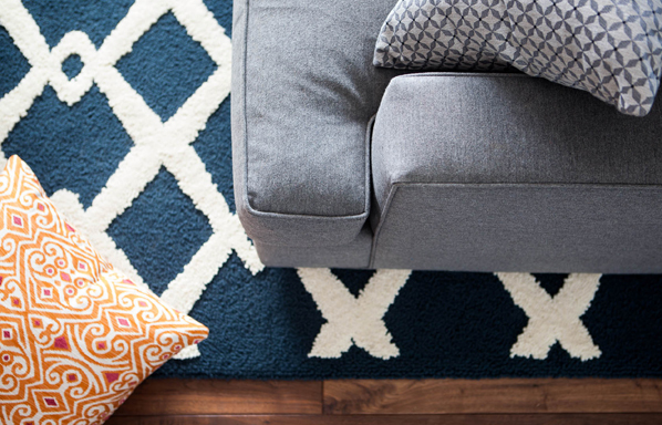
Cohesive color palette. One of the easiest ways to effortlessly mix patterns is with a restrained color scheme. You can still have vibrant color – just stick to varying tones of two or three colors. In the living room above we opted for a cool color scheme of blues and grays with orange and ivory accents. The large scale rug works well with the smaller scale patterns in the pillows.
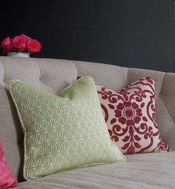
Scale is key. DO: Mix small prints with medium to large scale patterns. DON’T: Mix patterns that are the same scale. Why? They will compete with one another and feel too busy. The above patterns work well together because the green fabric has a 1.5″ repeat and the fuchsia fabric’s repeat is over 6″.
We love seeing patterns mixed together. It definitely takes a little more design sense than coordinating solids with a pattern, but the results are worth the effort. Multiple patterns give you that professional designer look.
Nice tips for pillow combination.Nice color combination tips you have given……
LOVE layering patterns! Never have been too successful at it, but I think this article will help!
I love the blue rug with the ivory crisscross pattern. Rugs are some of my favorite way to break up a room and add a focal point or a blending pattern to contrast against largely uniformly colored room. With so many rug options out there, putting together a bold room can be easier than you think.
The repeating pattern scale on rugs can be be very large, very small, or anywhere in between. So a rug is only going to expand your horizons rather than limit them.
Very beautiful! Wonderful interiors! You are very good designers. Widen the talent and skill. Make the world more beautiful.